

OVERVIEW:
The project was to create an all-in-one self-care and motivation app. The goal was to help users improve their lives through self-care and motivation. The app had a large scope, so this project focused on two user flows.
CLIENT:
Design Concept Project for a project with BrainStation
DESIGN TOOLS:
Sketch app, InVision, Figma, Adobe Illustrator.
THE PROBLEM:
One in five people in Canada experiences a mental health problem or illness each year. The COVID-19 pandemic increased mental health challenges due to social isolation, job loss, and widespread change.
How can we create an app that motivates users to take control of their overall health and mental well-being? This project focuses on helping users track their morning routine and mark tasks as completed.
MY SOLUTION TO THE PROBLEM:
I aim to create an all-in-one app to improve overall health and mental well-being. Many existing apps fall short by targeting specific audiences or functions.
This app will be a one-stop solution that serves as many users as possible, eliminating the need to download multiple apps. I want users to keep this app permanently—making it the first thing they use in the morning and the last thing they use at night.
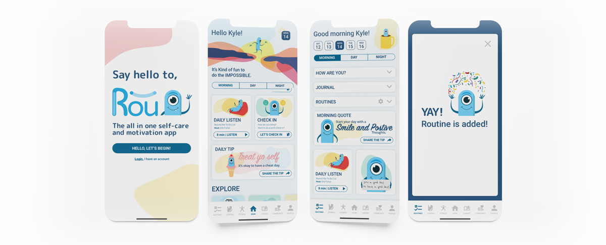
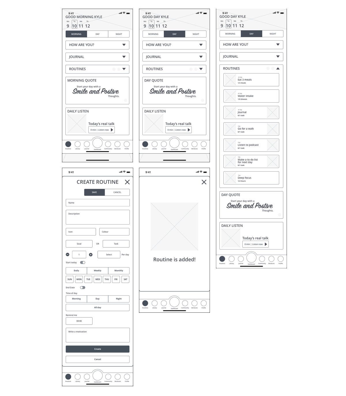
For this project, I'm focusing on tracking and building morning routines. I want to create an environment where users feel motivated to check off tasks and keep coming back daily.
My goals are to help users feel happy and motivated even on difficult days, and to create a simple, user-friendly interface that prevents overwhelm or confusion. The main focus is enabling users to log in, check off one morning routine task, and create new routines.
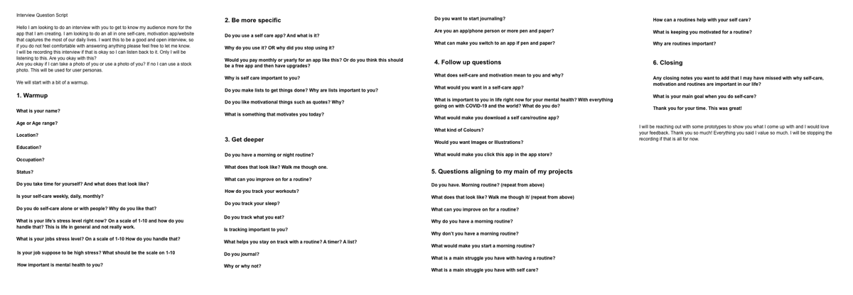
RESEARCH - INTERVIEW:
I interviewed five people to capture different perspectives: those with established routines, those who track workouts, and those without routines.
My interview had six sections: Warmup (getting to know them), Specifics (details on key points), Deeper dive (exploring answers further), Follow-up questions, Questions aligned with my project focus, and Closing. In a larger project, I would interview more people from my target audience.
INTERVIEW SYNTHESIS
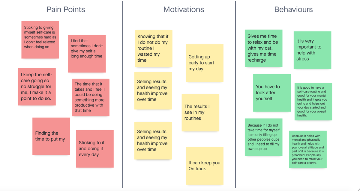
INSIGHTS

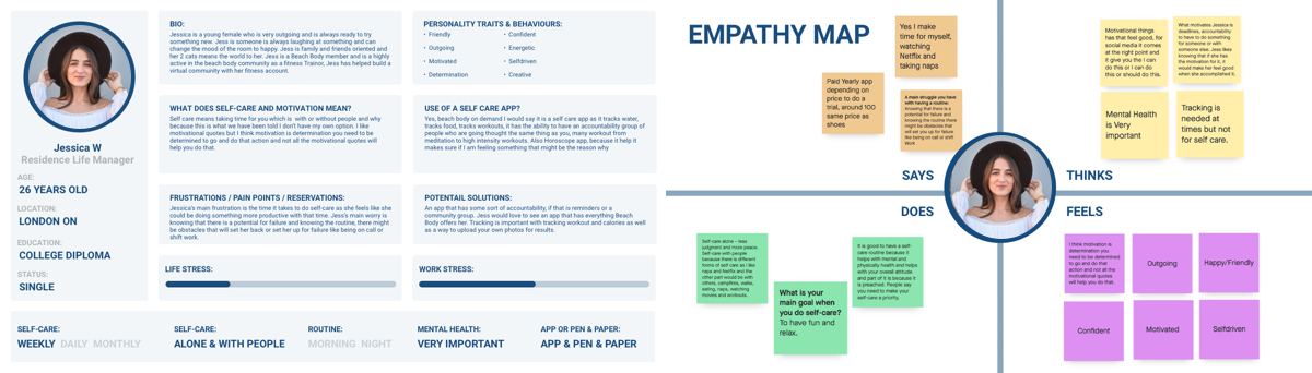
Persona and Empathy Map 1
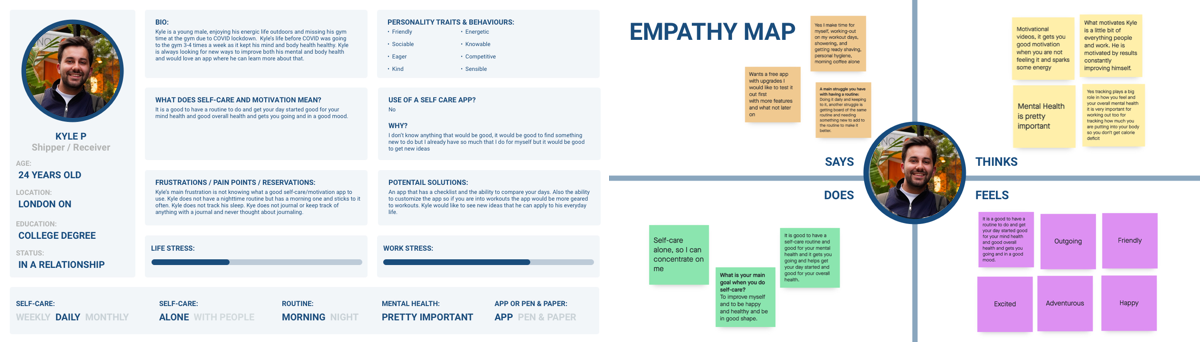
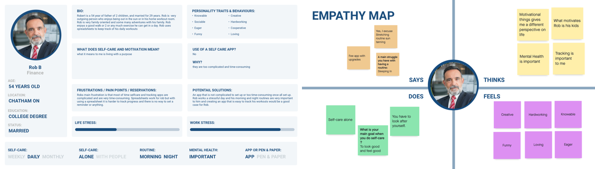
Persona and Empathy Map 2
Persona and Empathy Map 3
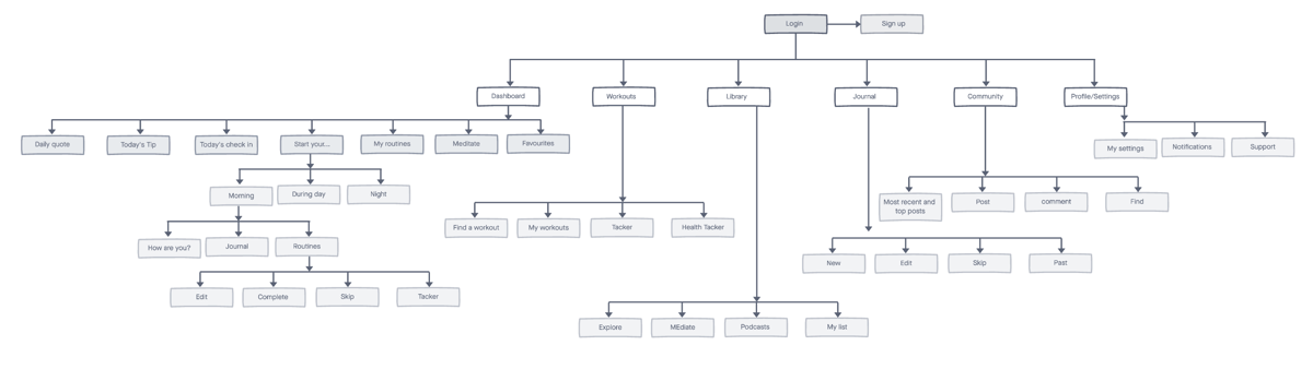
INFORMATION ARCHITECTURE
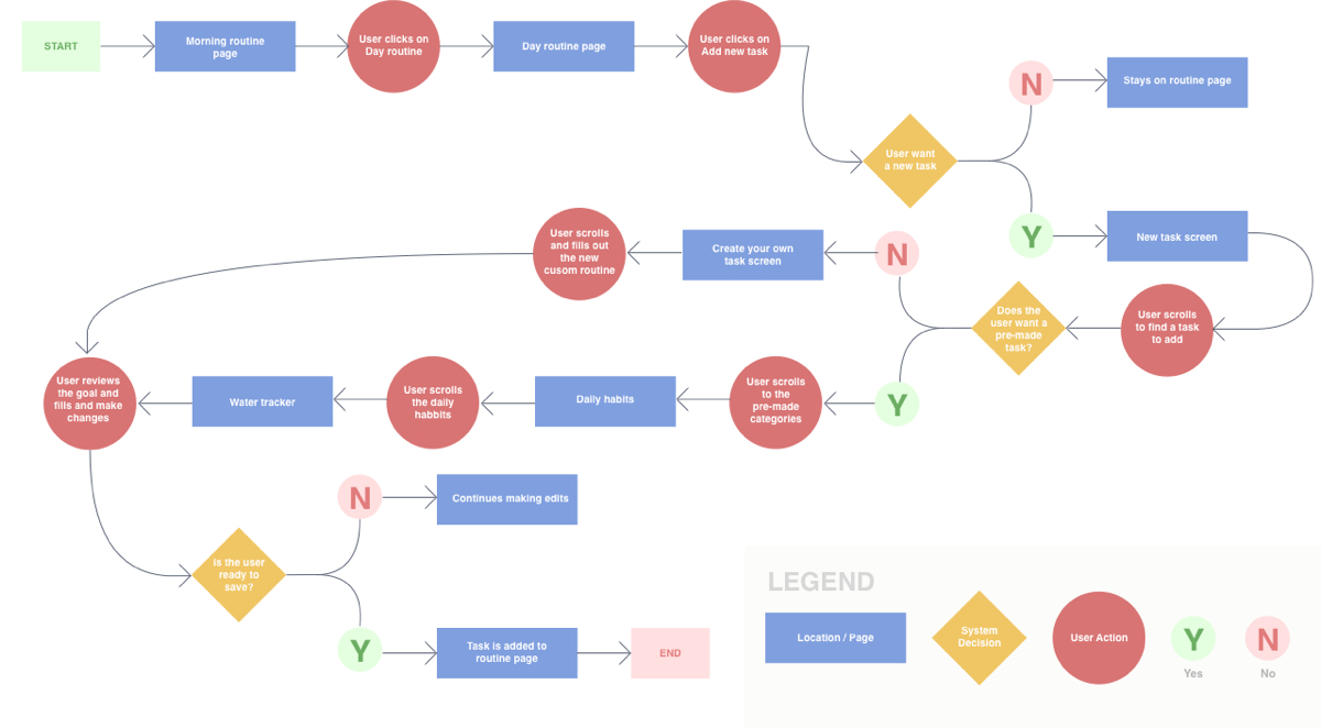
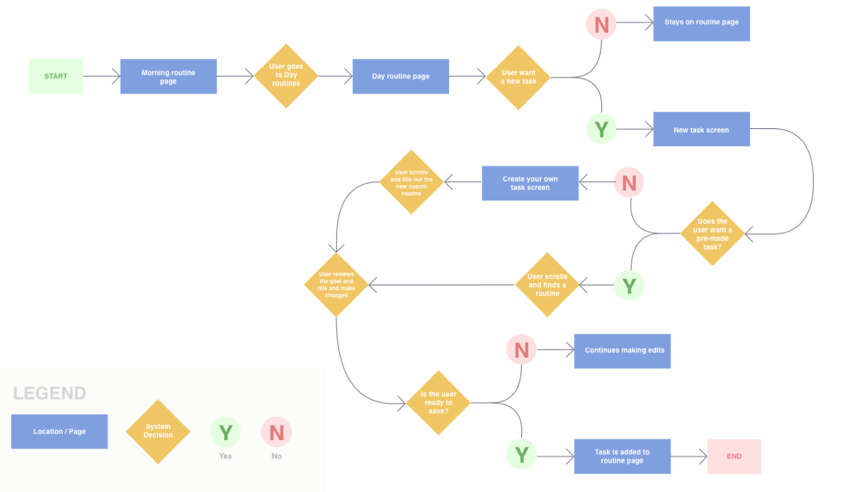
User Story Flow - 1
I want to start my morning routine and mark that I did a 15-minute workout on my morning tracker.
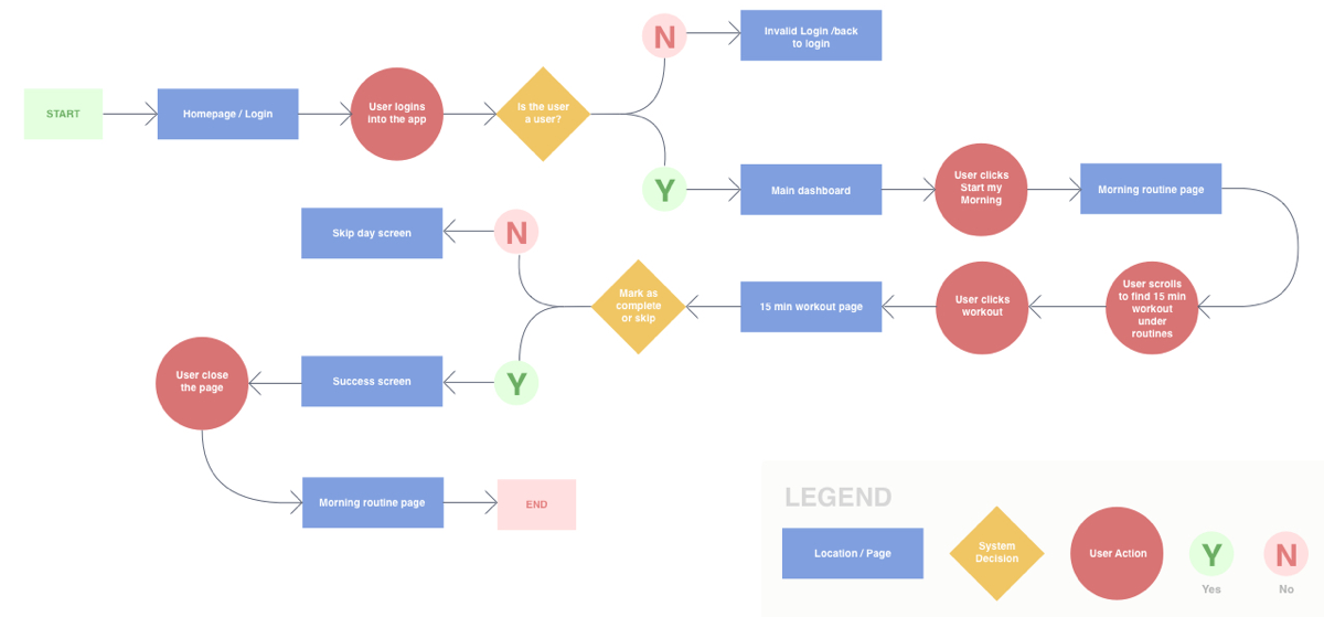
Task Flow - 1
Mark a workout as complete.

User Story Flow - 2
I want to add a new task so I can complete it. I want to add a new custom routine to my daily routine.
Task Flow - 2
To add a new task to my daily routine.
Sketch - Flow 1
Wireframe - Flow 1

Sketch - Flow 2
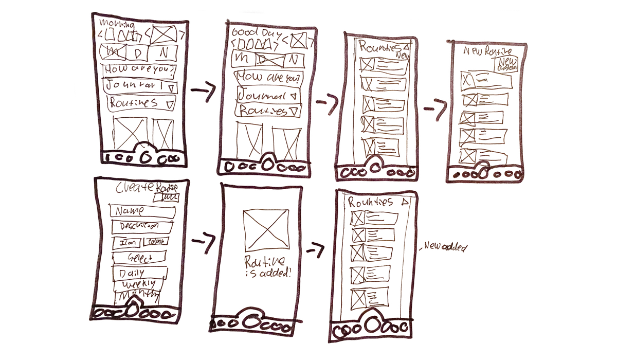
Wireframe - Flow 2
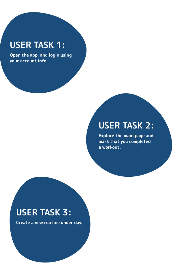
User Testing:
I conducted usability tests on my prototype with three users using three simple tasks. I also showed the design to a few people for overall feedback.
NOTES:
• Pretty bold colours.
• The main nav has routines that don't make sense—you still have to go to "You," and the journal should be removed since it's already in "You."
• Looks organized and the icons fit well.
• I like the colours, but the bottom nav feels busy with large icons.
• The weather is a nice touch for an app like this.
• Some wording is confusing and could be improved, especially in insights.
• Clicking reports shows too much information at once.
• All the drop downs being open simultaneously is overwhelming.
• Overall feel is great—some spacing and font cleanup would polish it further.
• Great design and the app is very well planned out.
• Clicking the workout requires too many clicks to see that you completed a workout.
• I would move insights to the top where the calendar is.
Iterate & Re-Test Prototype:
Outcomes:
After user testing, I refined my design by cleaning up and fixing several items, then tested again. There were no major changes—mostly overall cleanup. I improved the app's spacing and reduced the number of clicks needed to complete a workout. Previously, users had to click the screen to mark a workout as done; now it's completed directly under routines, and the overview/insights appear when you click the routine.
I learned a lot from user testing. It was difficult not to guide users—I wanted to explain the app, but I needed to observe how they naturally used it and what they clicked on. I did have to adjust a few links after the tests.
My final iteration is similar to my sketches but also different in some ways. Wireframing helped with planning everything out.
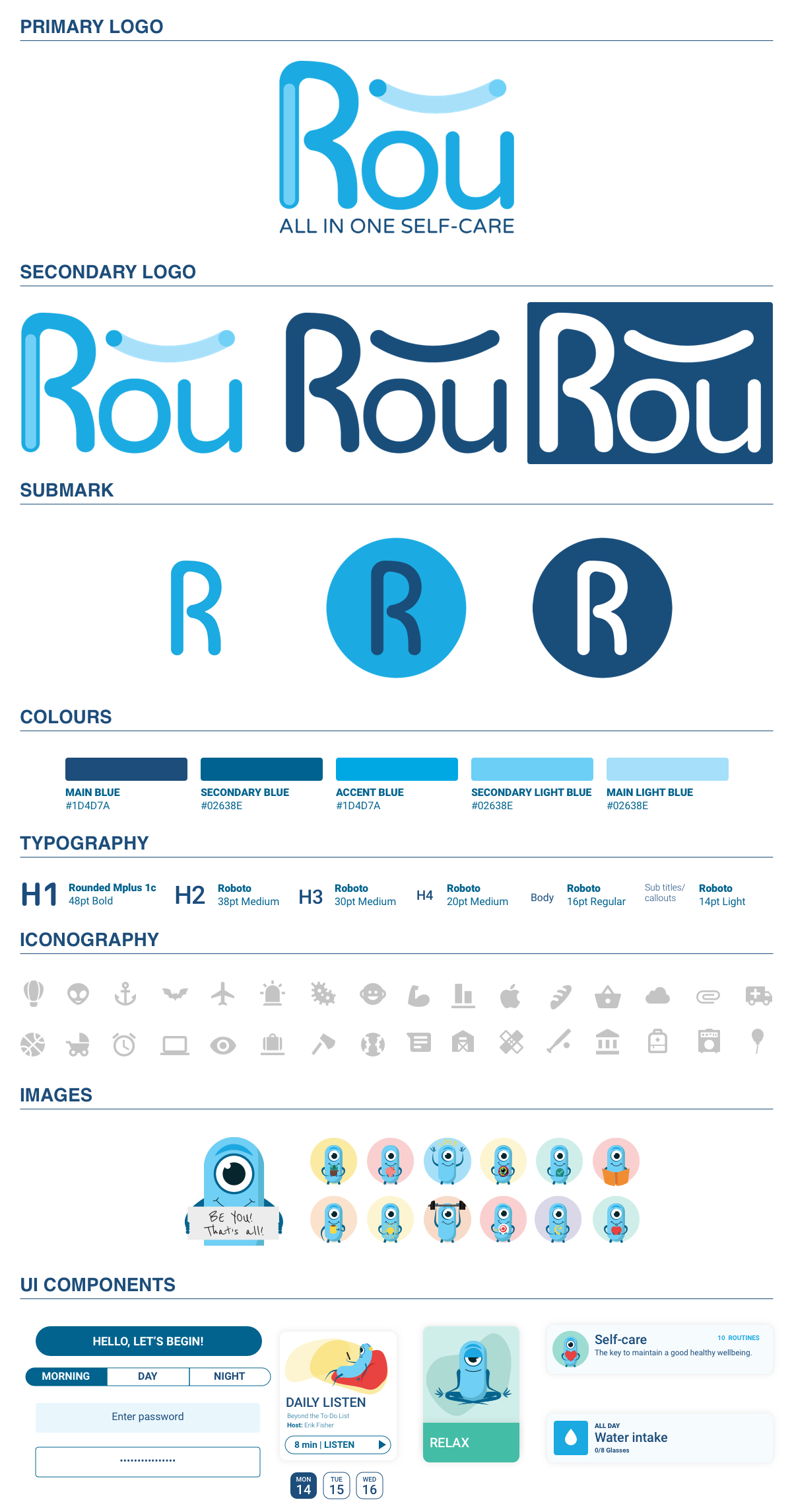
Style Guide and Design System:
Live prototype:

Learning Outcome:
I learned a lot during this User Experience Design course and through this project. I gained new skills and tips that I can apply to my design career and use to improve my designs. I learned how to identify problems and develop solutions while keeping the user in mind. I also learned about design thinking and information architecture and how to apply these concepts to my everyday design work. I will continue to apply these skills to all current and future projects.